WELCOME TO
THE NEW ERA
OF BENBOW
Wir sind ein Unternehmen mit einer langen und reichen Geschichte in der Herstellung von pneumatischen Werkzeugen. Was uns wirklich auszeichnet, ist unsere unerschutterliche Leidenschaft und unser Engagement. Unser Team besteht aus echten Enthusiasten – Menschen, fur die Gerate, Werkzeuge und Zubehor nicht nur ein Beruf, sondern auch eine Leidenschaft sind, der wir unser ganzes Herz widmen.
Wir sind auf die Entwicklung und Produktion von Ausstattung fur Lackierereien, Werkstatten, Autowaschanlagen und Detailing-Studios spezialisiert. Im Laufe der Jahre haben wir uns unschatzbare Erfahrung angeeignet, die es uns ermoglicht, Produkte von hochster Qualitat zu liefern und die Erwartungen selbst der anspruchsvollsten Kunden zu erfullen.
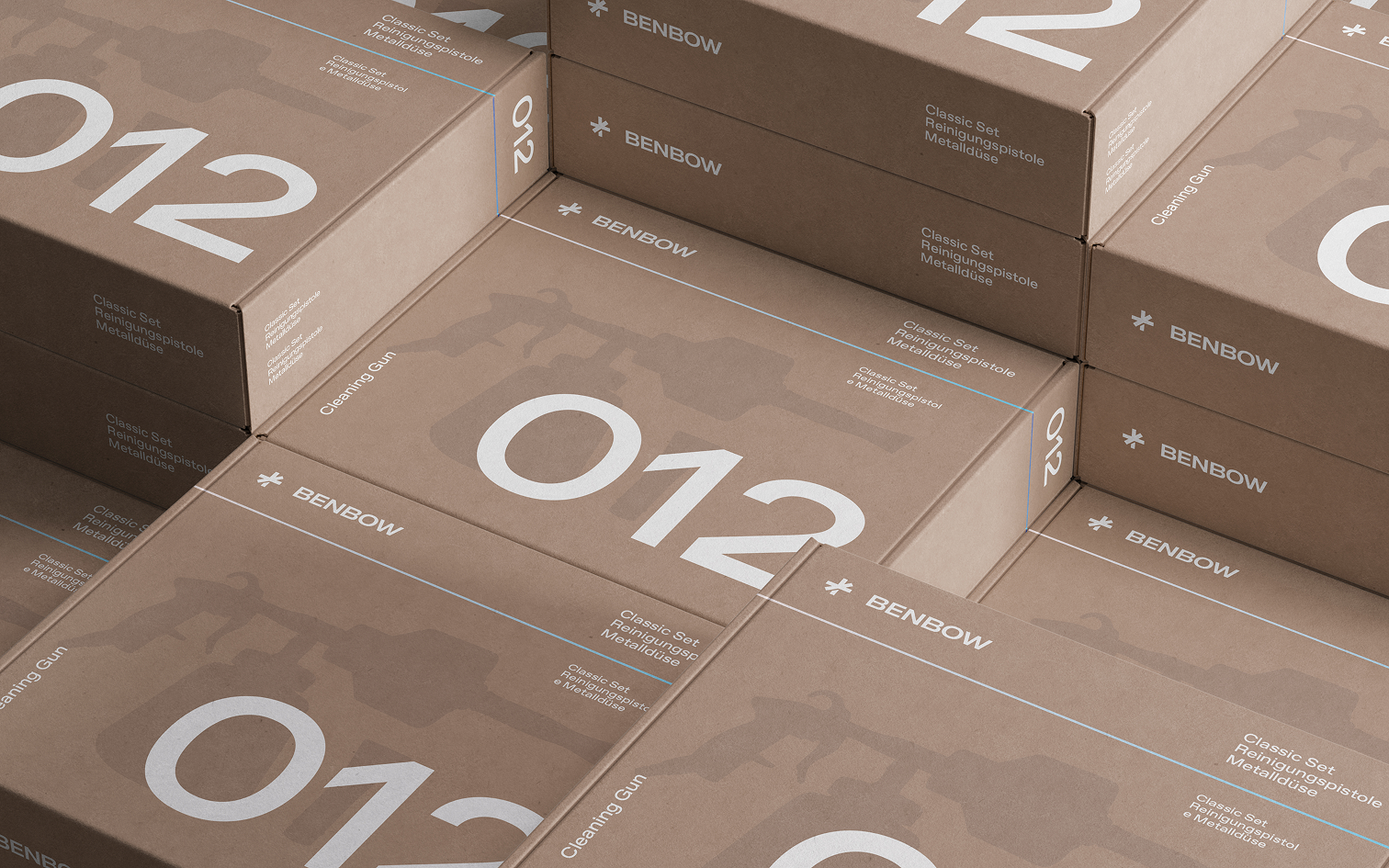
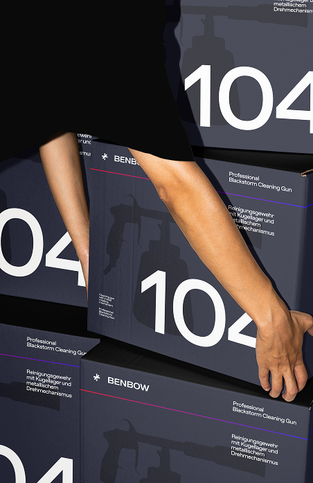
NEUES LOGO.
DIE GLEICHE
PROFESSIONALITÄT.
Das Rebranding von Benbow umfasst ein aufgefrischtes Logo, eine modernere Typografie sowie eine neue, kraftigere Farbpalette. Die Schlusselelemente sind:
- Ein grafisches Zeichen aus dynamischen, sich kreuzenden Linien, das ein Symbol fur Richtung, Bewegung und Prazision bildet. Das Zeichen bleibt schlicht, hat jedoch einen technischeren und professionelleren Charakter erhalten.
- Typografie – die Schrift ist geometrischer, selbstbewusster und kraftiger. Sie unterstreicht den technischen Charakter der Marke.
- Farbpalette – ein Set auf Basis von intensivem Elektroblau, tiefem Schwarz und dynamischen Farbverlaufen (Rot–Violett–Blau). Diese Farben symbolisieren Modernitat, Kraft und das Tempo der Entwicklung.
Die neue visuelle Identitat ist skalierbar, markant und funktional – sie funktioniert sowohl auf hellen als auch auf dunklen sowie auf Verlaufshintergrunden und ermoglicht eine breite Nutzung in digitalen Medien und B2B-Materialien.

BENBOW ist nicht nur eine Marke – es ist eine Garantie fur Zuverlassigkeit und Langlebigkeit. Wir entwickeln Werkzeuge, die nicht nur funktional, sondern auch asthetisch ausgereift sind, mit Aufmerksamkeit fur jedes Detail, selbst fur das kleinste.
Die neue visuelle Identitat ist skalierbar,
markant und funktional – sie funktioniert gut
auf hellen, dunklen und Verlaufshintergrunden, was
eine breite Nutzung in
digitalen Medien und B2B-Materialien ermoglicht.

MARKENTRANSFORMATION
VON BENBOW UND IHRE VERBINDUNG
ZUM TORNADO-EFFEKT
Das neue grafische Symbol von BenBow ist eine naturliche Entwicklungsstufe der Marke und markiert den Ubergang von ihrer fruheren lokalen Identitat zu einer modernen, internationalen Bildsprache. In Polen wird der Name BenBow umgangssprachlich oft synonym mit dem Begriff „Tornado-Effekt“ verwendet, was auf die wiedererkennbare Technologie der spiralförmigen Luftbewegung und die charakteristische Funktionsweise professioneller Reinigungsgerate zuruckzufuhren ist.
Das neue Zeichen greift dieses Erbe durch eine dynamische, abstrakte Form auf, die von Bewegung, Rotation und gebundener Luftenergie inspiriert ist. Geometrische Linien schneiden sich in einem Punkt und symbolisieren Prazision und Kraft – Schlusselelemente sowohl der BenBow-Technologie als auch von Geraten mit Tornado-Effekt.
Gleichzeitig fuhrt die minimalistische Form die Marke in eine vollig neue Dimension. Sie ist schlicht, kraftig und leicht wiederzuerkennen. Entwickelt fur den Einsatz auf jedem Markt – ohne Ubersetzung oder zusatzliche Kennzeichnungen. Das Zeichen vermittelt Geschwindigkeit, Richtung und Energie – Eigenschaften, die BenBow als Marke in der Phase globaler Expansion definieren.
Das neue Symbol verbindet somit die Vergangenheit mit der Zukunft:
- Es bezieht sich auf die in Polen als „Tornado-Effekt“ bekannte Technologie, die stark mit der Marke BenBow verbunden ist.
- Es entwickelt die visuelle Identitat von BenBow weiter und verleiht ihr eine modernere, ikonische Form.
- Es positioniert die Marke international, indem es ein klares, selbstbewusstes Zeichen einfuhren, das eigenstandig funktionieren kann.
Kurz gesagt ist das neue BenBow-Zeichen die Essenz dessen, wofur die Marke schon immer stand – Kraft, Prazision und Bewegung –, prasentiert in einer zeitlosen, globalen visuellen Form.

LICHT.
RICHTUNG.
PRÄZISION.
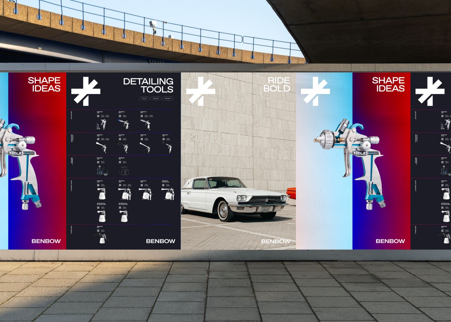
BenBow erweitert sein Angebot dynamisch, geht neue Partnerschaften ein und baut eine immer starkere Position auf dem Markt fur Detailing- und Lackierwerkzeuge, spezialisierte Zubehorteile sowie Losungen fur die Automobilbranche auf. Die bisherige visuelle Identitat spiegelte den Umfang und die Richtung des Markenwachstums nicht vollstandig wider. Das aktuelle Erscheinungsbild ist modular, flexibel und leicht in unterschiedlichen Umgebungen einsetzbar (E-Commerce, soziale Medien, Kataloge, Handbucher und POS-Materialien).
Das neue Ziel war es, eine visuelle Identitat zu schaffen, die visuell konsistenter ist, sich fur den Einsatz in modernen digitalen Kanalen eignet und auf Produkten, Verpackungen sowie technischen Materialien klar erkennbar ist.
IMAGES
Das neue Logo und die Farben betonen Prazision und Kontrolle – entscheidend im Kontext von Werkzeugen, Messungen und Zubehor; Modernitat und Innovation – zentral fur den Aufbau eines Wettbewerbsvorteils; sowie Energie und Dynamik – und zeigen, dass BenBow keine statische Marke ist, sondern ein Partner, der sich standig weiterentwickelt.
FUR EINE JUNGER E
ZIELGRUPPE
Fachleute und Technologiebegeisterte erwarten Marken, die die Sprache zeitgenossischen Designs sprechen. Die neue visuelle Identitat erleichtert zudem die Ansprache neuer Kundensegmente, einschliesslich E-Commerce und spezialisierter Branchen.
#121626
#2D3AE9
#2D3AE9 → #FF0000
#DFDAF5
#FFFFFF